The Case for Cars With Actual Buttons
In a touchscreen age, the smartest cabin innovation might be the humble switch you can find without looking.
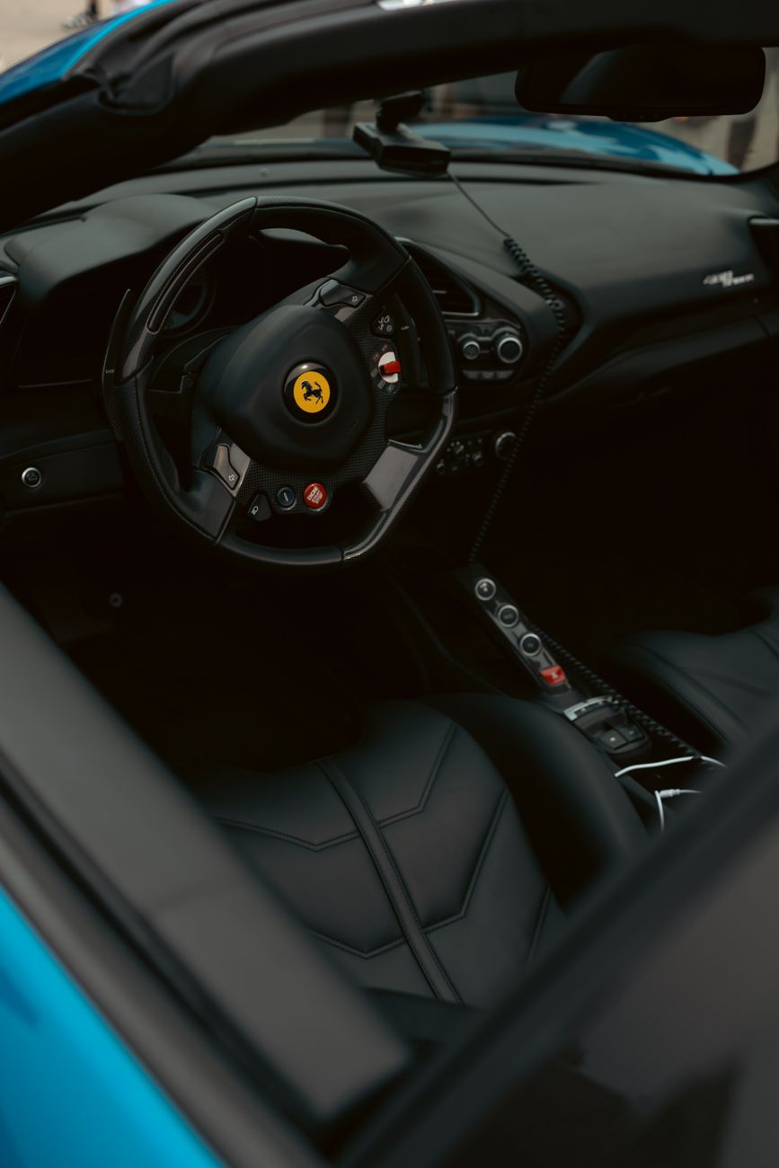
It starts at night, in rain, on a roundabout lit like an interrogation room. You need demist, temperature down, fog lights on, and the song changed before the chorus collapses under your own bad mood. In older cars, your hand knew the route before your brain finished the sentence: twist, click, done. In newer ones, you stab at a glowing slab like a man trying to unlock a nightclub with a bank card. Progress, apparently, now means taking your eyes off the road to adjust the fan speed.
The screen won the showroom, not the road
Carmakers didn’t fill dashboards with glass because drivers begged for it; they did it because screens look expensive, update cheaply, and photograph beautifully under motor-show lighting. A single panel can replace a forest of parts, which is marvellous for procurement and dreadful for instinct. The problem isn’t technology itself. It’s the confusion of sleekness with usability. A volume knob is not nostalgia. A climate button is not reactionary. They are mechanical shortcuts between intention and action, and in a moving machine, that matters more than whatever futuristic theatre the brochure is selling.
The best car tech is the stuff you can use at 70mph without negotiating with a menu.
The point isn’t that every modern cabin should look like a 2004 hi-fi stack. Good design evolves. Voice control can help. Smarter software can help. But the essentials — heat, volume, demist, drive modes, hazards — should live where your fingers can find them in the dark, by feel, with zero ceremony. The truly premium move now isn’t another bigger display. It’s restraint. It’s a manufacturer brave enough to admit that the shortest distance between driver and machine is still a button with a proper click.
